How I Generated the “Coin” Icon for the Yunee App
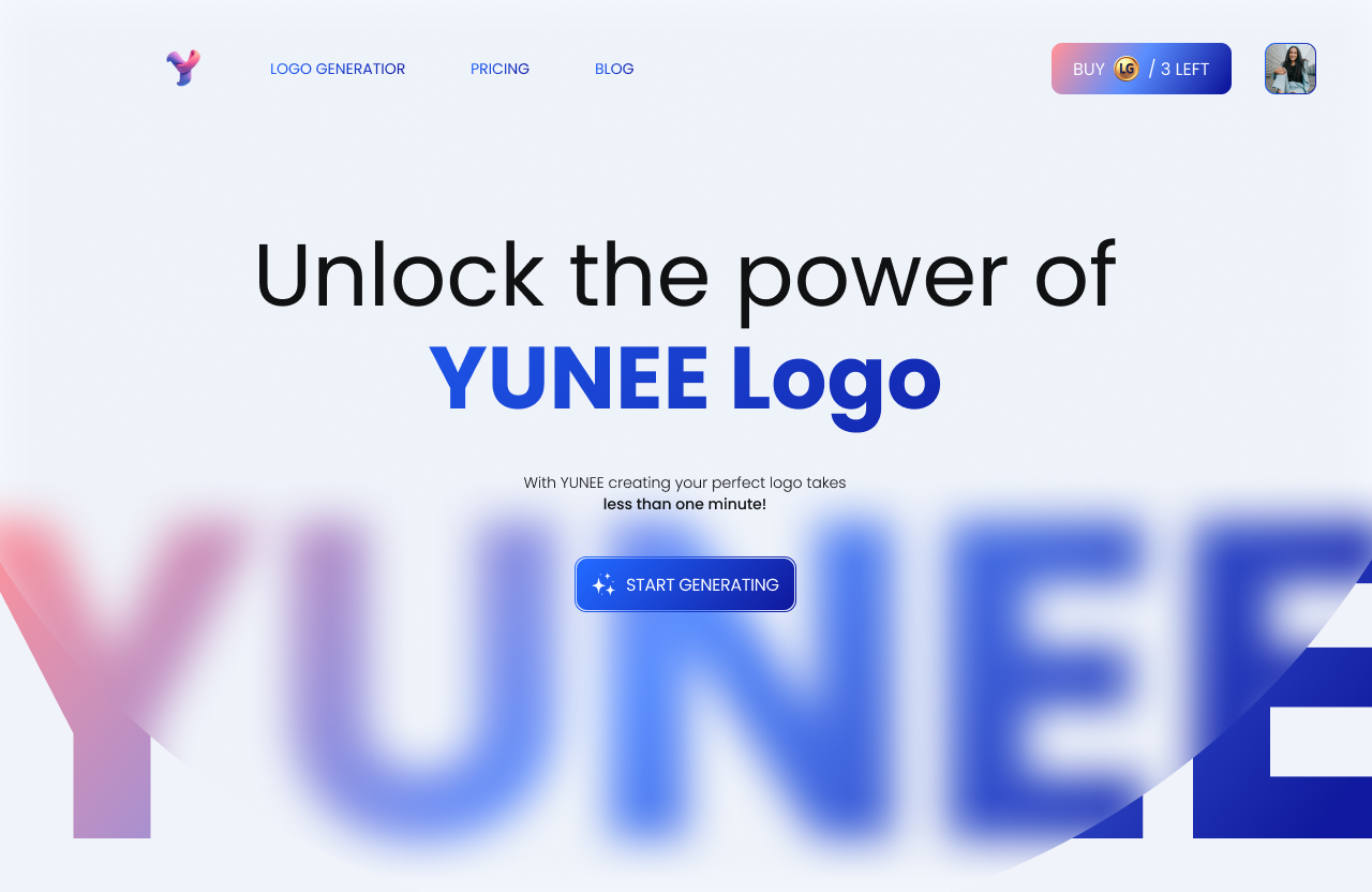
In this blog, I’ll walk you through the step-by-step process of creating the coin icon you’ll find on the Pricing page of the Yunee app. Here’s how it looks today:
Step 1: Crafting the Perfect Prompt
Before generating a logo or icon, I always think about the key design elements I need. In this case, I wanted a coin icon to serve as a button for selecting plans (check out the Pricing page link). Besides defining the core element, I also focused on the colors and style that would suit the branding of the Yunee app.
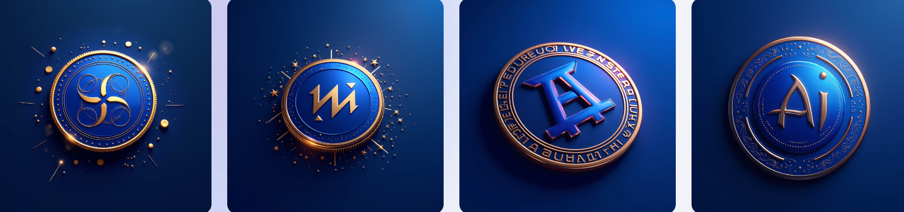
Once I decided on these details, I created the first prompt with the following inputs:
Brand type: AI logo generation
Element: Coin
Color: Royal blue
Style: Golden
Here’s the result:
Even though I loved the initial outcome, testing different options is always part of my design process. You know that feeling when your first attempt turns out great, but there’s a little voice in your head saying, "Try a few more times, just to be sure"?
Step 2: Testing and Refining the Coin Design
I decided to experiment further and refine the inputs. One thing that intrigued me was the "AI" text that the generator added to the first design. This gave me the idea to replace it with "LG" (Logo Generation) to make it a unique “Yunee currency,” which I could integrate across the entire app design.
Here’s how I modified the prompt:
Brand type: AI logo generation
Element: Coin with LG inside it
Color: Royal blue
Style: Golden
Here’s what I got:
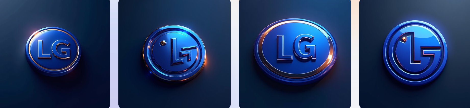
This design reminded me a bit of the LG brand, but the second and fourth versions felt innovative and authentic. They were visually distinct and didn’t resemble any existing brand or logo, which was exactly what I wanted.
Since the coin was already generated in 3D style, I decided to specify 3D directly in the prompt to see what would change. I updated the input as follows:
Brand type: AI logo generation
Element: Coin with LG inside it, 3D
Color: Royal blue
Style: Golden
Here’s the result:
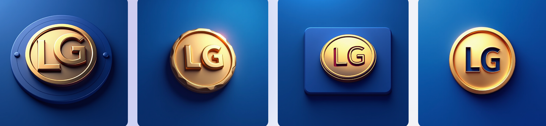
I noticed that specifying 3D slightly changed the coin’s color, which gave me more flexibility in deciding whether I preferred a golden coin or a blue one. So, I generated one more version with the following inputs:
Brand type: AI logo generation
Element: 3D coin with LG inside it
Color: Royal blue
Style: Golden
Here’s the outcome:
In the end, I found that blue worked better for the overall aesthetic, so I returned to my initial ideas and moved on to the final step.
Step 3: Applying the Coin Icon to the Design
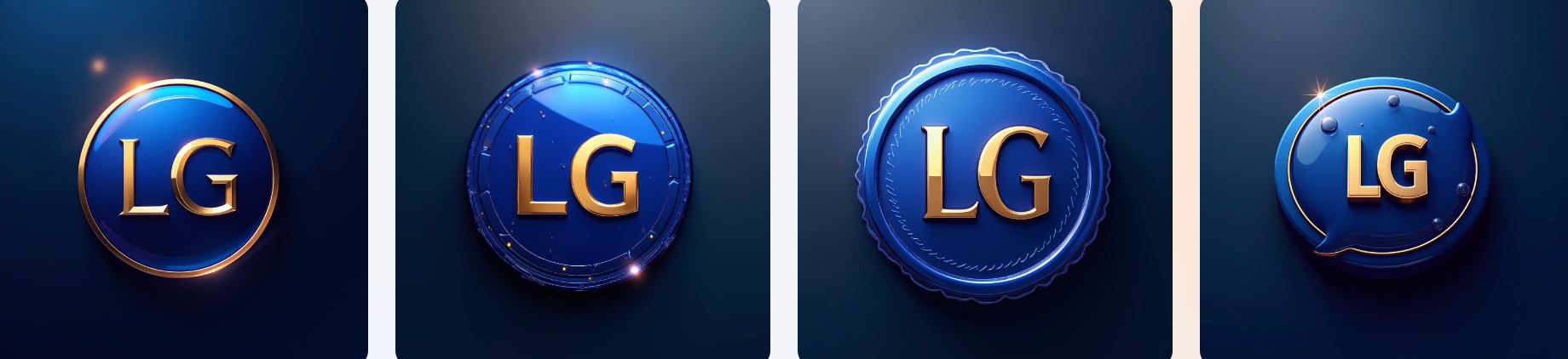
The final step was to apply the generated coin designs to the buttons on the Yunee app and evaluate which one fit the best.
Since the app uses two different button styles, I tested all the promising coin icons to determine which one looked the most cohesive with the design. Here’s how the coin icons appeared on the buttons:
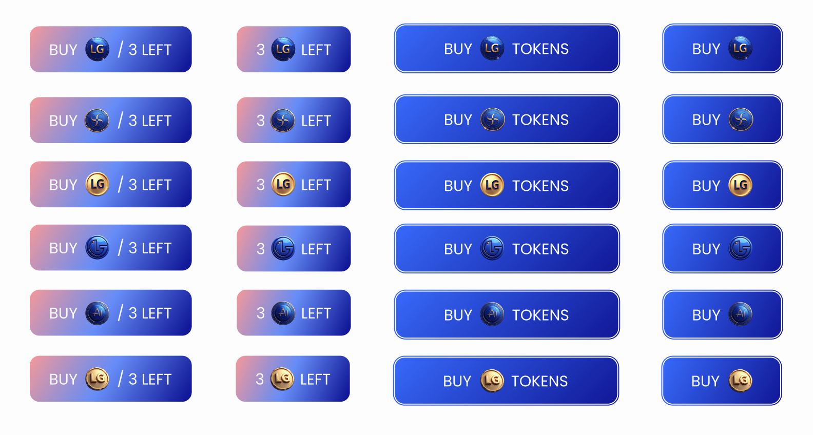
This was a tough choice! Each version looked fantastic, and I was thrilled with how well they aligned with the button styles.
However, I had to pick one. Here are the factors I considered when making the final decision:
How visible is the coin on the button background?
Is the contrast strong enough?
Does the coin look good on a gradient background?
Is the text on the coin readable when the coin is in blue?
After answering these questions, I arrived at the final version, which looks like this:
Conclusion
When generating designs with AI, it’s essential to have a clear vision of what you want. Precise inputs lead to better results, so take the time to define your goals before starting the process.
Ultimately, design is an iterative journey - experimenting, testing, and refining are key steps to creating something unique and aligned with your brand vision.